MADS GAMDRUP


MADS GAMDRUP
28.05.21 – 16.07.21

It is our pleasure to present Mads Gamdrup’s 5th solo exhibition at NILS STÆRK⁠ ⁠

How do we perceive color? It is the characteristic of visual perception described through categories with names such as yellow, green, red. The perception of color derives from the stimulation of photoreceptor cells, in particular crone cells in the human eye, by electromagnetic waves radiating between two surfaces. Yet, this technical description does not explain the memory of a specific color when reminiscing a specific evening by the countryside, how we experience colors differently or even that we see colors in our dreams.⁠ ⁠

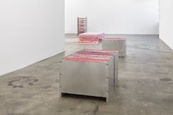
In a series of new paintings, Mads Gamdrup continues his lifelong occupation with color research yet moving into a radically new direction both formally and visually speaking. Each painting elaborates on Gamdrup’s interest in monochrome color and its artistic potential in relation to phenomena such as materiality, both physically and psychologically. Working with raw color pigments in the extended field of contemporary art, color can be perceived as a material substance with abstract qualities, giving the pictorial expression a spatiality that opens up, allowing for an individual interpretation.⁠

-
Photography is Painting with Light. Mads Gamdrup’s New Works 

Mads Gamdrup (b.1967) has been working with photography for three decades, but in this exhibition he shows monochrome painting. The step from photography to painting is radical but, in relation to Gamdrup’s artistic practice, also logical. The question raised is: ‘How much light does colour absorb?’ The preoccupation with the impact of light on our vision has been central to his work with photography; now he uses painting to answer the question.

Colour and light

The word ‘photography’ derives from the Greek phos, meaning light, and graphō which translates as writing, drawing or painting. If we look at the meaning of the word photography, we understand how crucial the question of light and the experience of colour is for photography, and also how it can lead to painting and to expressing oneself in colour. Photography is, in other words, painting with light. 

Light is crucial to how we perceive colour. Aristotle (384-322 BC) in his time was already able to state that ‘Light is what makes objects visible to us’, but the fact that the perception of colour differs under different lighting conditions, and in different individuals, is something that still puzzles and interests scientists today. We might argue that the sky is blue, but is it actually? How colour appears depends on the lighting ratio at a particular time, yet we see the sky as blue because that is what we expect it to be. There are both physiological and psychological and, we might add, cultural variations in the way colour is perceived. Goethe (1749-1832) even thought that ‘colour theory is an interdisciplinary area of knowledge involving research in physics, chemistry, biology, physiology, psychology and art.[1]’ 

If we look up colour in an encyclopaedia, we can read that it is a ‘... physical and material property of objects which is related to their interaction with electromagnetic radiation.’[2] Newton (1642-1727) was the first to demonstrate that light waves are refracted differently in the transition between air and glass. He passed white light through a prism and found that it separated into a spectrum of colours: violet, indigo, blue, green, yellow, orange and red.[3] In a stricter reality, however, there are only three colours, red, green and blue that the eye can perceive, but when these colours are placed close together, we experience more. Albers’ (1888-1976) studies in particular have established this: ‘The purpose of most of our colour exercises is to prove that colour is the most relative medium in art, that we almost never experience colour as it physically is.’[4] In order to arrive at a system capable of dealing with and describing colour many people have turned to colour theory, that is, the study of the characteristics, use and composition of colour. Newton’s more than three-hundred-year-old observations, and the colour systems based on them, are considered groundbreaking. Goethe, however, questioned Newton’s studies in optics; for him the nature and properties of colours were more important than their chemical or physical composition.[5] 

How a colour is experienced in relation to other colours has to do with perception and adaptation to the given conditions. A perfect example of adaptation is simultaneous contrast, or chromatic induction, which occurs when the same colour is perceived differently depending on which colour it is juxtaposed with. If complementary colours are placed next to each other, the transition will flicker. The same effect can occur with other colour combinations, and this has often been exploited by artists. ‘To achieve the effect of a luminous moon [in traditional Asian art] in a landscape, the moon is laid down as a white circle against a grey sky. This makes the moon appear to shimmer with an inner light, due to the effect of the white paint on the grey.’[6]

Painting

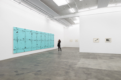
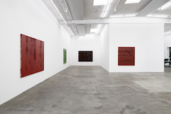
Mads Gamdrup’s new work has a strong physical presence in the gallery space. There are nine large monochrome paintings executed in the traditional technique, which means that genuine colour pigments are hand-ground with raw linseed oil. The paint is applied with both paintbrushes and a broom to the canvas whose dense linen grain has been coated with glue and a number of oil-based gesso layers before being mounted onto a stretcher. The pure oil paints laid onto the canvas with a brush or broom are Dark Burnt Sienna, Indian Red, Primary Yellow and Chrome Oxide Green.

The term monochrome should be understood literally, as only one colour was used for each painting, which is not usually the case, not even with monochromes. The paint has clearly been ground so as to achieve as much texture and pigment saturation as possible and, combined with the repeated long brushstrokes, the paint gains texture and variety. The beauty of oil paint is that it can be applied so that it is either opaque or transparent, pastose or thin, depending on how much linseed oil is mixed into the paint. If only one colour is used, it is essential that it should be capable of evoking both depth and lustre as well as changing hues, which occur when light is refracted in a painted surface. Untitled (CF035313), 2021, is an example of a decidedly colour-heavy painting where the artist has used the linseed oil sparingly, working mainly with impasto but also with more thinly coated and glossier sections, contrasting matt with gloss in distinct layers.

Photography

Gamdrup’s artistic research has largely been about what colour is and how it works in different constellations. Already his early large-scale landscape photography presented an investigation into light and colour, but he found that the interest of the viewer and the discussion got stuck in the purely representational aspects. Observation led to a distancing away from the subject, a greater awareness of how light controls our perception and a conscious unravelling of the image.

The work series 21.06.99 and 21.06.01 indicate dates of the summer solstice. This is the time when the Sun reaches its greatest declination -- angular distance from the celestial equator -- and its highest point in the sky in the northern hemisphere. This is therefore the longest day of the year, and north of the Arctic Circle there is midnight sun. On this day Gamdrup was in Lofoten, Norway. He decided to set the camera’s shutter timer for 24 hours, resulting in nine shots in which small changes in weather and sea level could be observed. Exactly two years later the same 24-hour photography session was repeated in the southern hemisphere, in Harare, Zimbabwe. At this point in time it is the shortest day of the year there, and this same year also saw a solar eclipse. The comparison between the two photography experiments, whose results were almost negations of each other, showed how light controls colour. 

The desire to conduct a thorough study of the conditions of colour and light led to the work Monochrome Colour Noise, which is actually a technique for manipulating the unique properties of colour. This is achieved by creating varying degrees of transparency within the individual colour units, from pure colour to pure light. The work consists of colours derived from the torrent of colours accumulated over the years as the artist transferred his own analogue photographs to digital format, which were then transferred to photographic paper in the form of abstract stripes and dots. This technical point of departure for the photographic image may be regarded as a major step away from earlier productions, but Monochrome Colour Noise is still photography. With his subsequent productions he has abandoned photography entirely for painting, at first on glass. The glass paintings consist of stained glass that has been rolled out to form the background of a centrally placed circular field painted with acrylic paint. The glass maintains the transparency of the photograph, whereas the acrylic paint is pastose and impermeable. The works are framed and deliberately bring to mind those of Albers, which in turn refer to Goethe’s more experiential colour studies. These works give a clear indication of Gamdrup’s further research.

Painted colour

The paintings in the new series may seem a far cry from earlier, technically accomplished, large-format photographs of still, bare landscapes and environments in intense colours. These photographs are part of a tradition of Straight Photography, in which the subject is rendered without manipulation. The negative may not be cropped and advanced darkroom techniques are used to achieve an aesthetic characterised by sharpness, high contrast and rich tonality.[7] Straight Photography refers to photography that renders a subject in sharp focus in accordance with the qualities that distinguish photography from other visual expressions, not least painting. The world should be represented as it really is.

This reporting quality of uncompromising objectivity and avoidance of distortion, a striving for technical objectivity in the work, is also present in Mads Gamdrup’s new work. It is not only painting in a more general sense, but also a new and ingenious method in the continuing study of how much light colour can conceivably contain. 

Åsa Nacking

Åsa Nacking (b.1963) is the director and artistic supervisor of the art gallery Lunds konsthall. She previously worked for the Rooseum Center for Contemporary Art Malmö; the Louisiana Museum of Modern Art and Moderna Museet Stockholm. She is an art historian and holds an MA in Visual Culture from Lund University and a curatorial degree from De Appel, Amsterdam.


NILS ERIK GJERDEVIK


NILS ERIK GJERDEVIK
27.03.21 – 22.05.21

‘In my pictures, besides, there are many small forms in vast empty spaces. Empty spaces, empty horizons, empty planes, everything that is bare and empty always impresses me ... I get my ideas from the simplest things. I prefer a plate out of which a peasant is eating his soup to the ridiculously ornate plates wealthy people use ...’
(Miró, Jacques Dopagne, page 21)

Nils Erik Gjerdevik created art for four decades without anyone being able to ’place’ his endeavours within a specific art-historical strategy or position. Gjerdevik’s work cannot, therefore, be determined within the context of neither minimalism, modernism, or pop art. On the contrary, Gjerdevik’s works can best be described in the context of several fairly disparate genres. It is in the overlap between the rules of one ism and the next that it becomes possible to decipher the internal logic of his works from an art- historical perspective. Nonetheless, in order best to read Gjerdevik’s anarchist and detailed patchwork of references, one has to contemplate them through the lens of everyday life: could not an arabesque be of equal value to a tribal tattoo as a reference?

Gjerdevik’s works derive from a more extensive figurative universe and would seem to possess an almost Gaudian method of creating architecture where the building structure with its catenary arches and hyperbolic paraboloids doubles as both structure and ornamented tableau. Architecture is, after all, the most obvious analogy to Gjerdevik’s practice. Not merely by virtue of the relationship of painting to scale and the serial progression of his works on paper. To Gjerdevik, architecture proved an eternal source of inspiration and like structural engineering – man’s point of reference in nature – his works activate a physical and psychological relationship between space, picture plane, and viewer. By virtue of its scale, the main work in the exhibition could almost be characterised as a building structure. Its sheer size calls for more than a wall to show it. The painting requires a room to itself – if not an entire storey. Gjerdevik’s works usually embody potential for his paintings to be shown in major architectural and social contexts.

The exhibition addresses a specific part of Gjerdevik’s practice through works never previously shown: a 265 x 739 cm painting from 2008 and a suite comprising thirteen works on paper which were the last works Nils Erik Gjerdevik produced. Initially, the works were not created to appear in the same exhibition. Nevertheless, the consistent presence of abstract notations in black constitutes a common thread from the painting to the works on paper. Or perhaps conversely, the common thread is traced from the works on paper into the painting? If we look at the enormous main work in the exhibition, it is equally difficult to decide what constitutes the foreground and background in the painting. The black grid-like pattern competes in intensity with the turquoise plane of colour and it is difficult to determine which layer was applied first. In this way, the painting eludes the precept of the classic painting principle stipulating that the background come first. The flatness and sheer size of the work substitute the experience of looking at a painting with looking at a fragment of an unending but personal universe.

Like asteroid belts floating in nothingness, the many abstract formations in the overall grid structure could well function as illustrations of a cosmic duality between order and chaos. A similar analogy was formulated by Barnett Newman already in 1945:

‘Today’s painters could be said to work with chaos not merely in the sense that they handle the chaos emerging in an empty picture plane, but also in the sense that they manage a chaos of shapes. In their attempt at going beyond the visible and known world, they work with shapes that are unknown even to themselves.’ (Barnett Newman, Barnett Newman Tekster 1945-49, page 11)

Nils Erik Gjerdevik (1962–2016) exhibited at art institutions including: Hospicio Cabañas, Instituto Cultural Cabañas – ICC, Guadalajara, Mexico; Kunstmuseum Brandts, Denmark; Pratt Manhattan Gallery, New York, USA; National Gallery of Denmark, Copenhagen. His works are found in public museum collections, including: PAMM – Pérez Art Museum Miami, USA; National Gallery of Denmark, Copenhagen; Bergen Kunstmuseum, Norway; Malmö Konstmuseum, Sweden; the National Museum, Norway, and Kiel Kunstverein, Germany. Gjerdevik executed numerous public commissions and he was honoured with awards and distinctions for his exceptional contribution to the national and international art scene.


Conversation between the director at Gl. Holtegaard, Maria Gadegaard and researcher at Sorø Kunstmuseum, Christian Hald Foghmar who also worked as an assistant to Nils Erik Gjerdevik.⁠ 
Former CEO and chairman at Novo Nordisk, Mads Øvlisen presents Nils Erik Gjerdevik's installation at their global headquarter in Denmark. ⁠


"Over twenty years ago, Nils Erik Gjerdevik’s paintings made a significant and lasting impact on me, even when they were not nearly as large as the striking and expansive one from 2008 that is being presented in this exhibition alongside what became, a very productive eight years later, some of his last works on paper. I’m sure I will always see the entirety of his work in meaningful conversation with that of artists with whom I’ve become most familiar: those who are often too narrowly identified as “Los Angeles painters” whose work caught my eye and mind around the same time as his, in particular Laura Owens and Lari Pittman. To my mind Gjerdevik remains one of only a few late 20th/early 21st-century European painters who, like Owens and Pittman, not only took on the challenge of large paintings successfully, but also developed a pictorial territory that still resists being named. You could say that his paintings are not abstract and not representational, but such labels are lacking because they—like “non-objective”—resign themselves to the negative, and Gjerdevik’s work never, ever went for that.

                Don’t misunderstand: I’m not suggesting that Gjerdevik’s paintings are too positive or too ambiguous, happy-go-lucky or devil-may-care. Even if I hadn’t been the beneficiary of several deep conversations with him in his Copenhagen studio over these past two decades, it is clear that he always provided the work with the tools it needed to be able to challenge itself on its own terms. (This is the case with the paintings, works on paper, and the ceramics.) In isolation that claim of self-aware criticism for the work itself sounds especially modernist, even painfully formalist, but Gjerdevik always installed too many crucial points of connection in his works (think synapses, electric circuits, nervous systems) to make a clean break that in the case of a lot of “high” modernist work pushed separation over into alienation, or even worse, boredom.            

                Color is, of course, a powerful connector in both art and life, and Gjerdevik developed his use of it over the range of his work with deliberation and specificity. In paintings from the late 1990s (the first I encountered) the colors were usually extraordinarily varied and somehow simultaneously bright and muted (as were Laura Owens’s at the time), capable of creating form themselves that often pushed right up against the associative and nameable. By 2008 they had become far more limited in number but unapologetically bright, super-bright if you will. With that I remain fascinated by something I still don’t quite understand. Take the near day-go intensity of the blue-green of this painting. It is so institutional (there’s a station in the Berlin U-bahn that immediately comes to mind), so super-graphic yet it’s absolutely not. I know this is irreconcilable, and I’m fine with it.

                That such a color wouldn’t obliterate the array of intricate visual language that Gjerdevik had developed over the years and put to full “linguistic” use in this painting is remarkable. It is readable without needing translation, in both the lexicon of Gjerdevik’s overall vocabulary of shapes and gestures (and the gestural had been moving into the work for some time) and the potency of ornament and decoration throughout their histories. This is why this painting is an ideal one to introduce his last works on paper, as they communicate impeccably with each other while also making clear that the work was taking him and us and itself to yet another positive and productive place." 

- Essay by Terry R. Myers. Terry is a writer and independent curator based in Los Angeles.


TOVE STORCH


Tove Storch
Apple Romance
26.08 - 24.10.2020

We are very pleased to present Tove Storch’s third solo show at our gallery. The exhibition title, Apple Romance, is taken from a text which forms part of the exhibition and is written by the freelance curator and writer Paola Paleari.⁠

Encircled by Paola Paleari’s words, five sculptures fill the gallery space in close mutual dialogue. A striking common feature of the works is metal structures clearly bolted together, all of them supporting either heavy plaster or gossamer silk. The interplay of the materials, appearing almost erotic, dissolves the anticipated hierarchies and reactions of the interaction: the weight of liquid plaster deforms an ordered system of aluminium sheets fixed between frames while multiple layers of uneven pieces of silk in delicate shades of pink embrace a bed-like structure, cascading across the framework. The materials have all been dyed with liquid pigment, continuously working its way through the mass, creating a bubbly imprint with a flesh-like effect. ⁠


JONE KVIE


Jone Kvie 
what comes after certainty
14.11.20 – 27.02.21
 
There is 2,099 km between Naples and the north-western district of Copenhagen – a twenty-two-hour journey for an able driver. But a rock would require as many million years to travel the same distance to the gallery spaces in Copenhagen. Rocks operate with their own particular chronology, which is why working them up artistically always ends as a permanent monument to the impermanence of civilisation. Contrary to rocks which, at their own sedimentary speed, are constantly on the move, you and I are definitely here just now. It can be an overwhelming experience to be faced with nature and equally hard to describe the experience associated with it. In the same way, it takes time to take in the various elements of Jone Kvie’s latest exhibition. 
 
The point of departure for his new works is a metamorphosed encounter between geology, industry, and Western sculptural history. It is a pragmatic union of readily recognisable elements which re-emerge in a new, but also somewhat homeless form after being worked up by Kvie. They are like entropic deformities, marginalised by man – dissolved by nature. Earlier in his practice, he examined a figurative perception of astronomy; especially the moon as a motif, star clusters, and other visible objects in the sky which, for centuries, have been guiding man’s self-perception and navigation systems. Paradoxically, the moon and stars might be easier to relate to as popular pictorial references than nature in its pure and abstract form. Possibly because modern man, over time, has become alienated to nature.
 
The central point in the exhibition is the very heavy marble block with an hourglass-like figure cut in onyx. Classical sculpture traditions of the ancient world were formed around marble and onyx. The name ’onyx’ derives from the Greek word for claw or fingernail due to its similarity to the keratinised sheet found on the outer limbs of humans and animals. Both marble and onyx are the results of transformative processes lasting millions of years and, just like the human body, they carry with them accumulations of time. In this way, Kvie’s work extends from the geological processes of his materials. The onyx figure functions as a marker in the exhibition, possibly referring to time as an abstract dimension. Kvie’s choice of material is never insignificant nor accidental, but always applied thoughtfully and strategically. In the exhibition what comes after certainty, he presents universal and abstract issues which have absorbed mankind since time immemorial – it is a contemplative examination which always takes its beginning in the material.


CHARLOTTE BRÜEL


Interview with Charlotte Brüel from her studio


Charlotte Brüel
Invisible Sculptures
26.08 - 24.10.2020

We are pleased to present a solo exhibition by the Danish visual artist Charlotte Brüel for CHART 2020. The exhibition emerged out of a double fascination with the artist’s work and life, also reflecting the focus of the fair on women’s position in art. Parallel with the artist’s works, this publication presents excerpts from her work journal, providing historical anchorage for the story of Charlotte Brüel’s artistry. Her works recall the position assumed by the artist herself on the Danish art scene; in spite of continuous exhibition activities and several initiatives to set up alternatives to the traditional institutions, her artistic work has remained largely hidden from the public eye.

In Brüel’s latest works, the contradiction between nature and human processing is evident. The industrial acrylic glass displays seem to enclose a carefully selected array of sculptural studies in clay along with a suspended arrangement of found bird feathers. The acrylic glass cases, made of synthetic plastic, screen their organic contents like indestructible greenhouses – with the exception of a single display case that seems to be missing a large piece in one corner. Using a simple artifice, Brüel emphasises the fact that the minimalist displays are inextricably linked to the individual content of the sculptures.

The collective title of the works, Usynlige skulpturer (Invisible Sculptures), also appears to support the transparency of the glass as a material quality. The severed bird wings on display in one of the terrarium-like acrylic glass cases are a universal symbol of an ultimate sense of freedom and, at the same time, of the deprivation of that freedom. For the viewer who, from his bird’s eye view, looks down at the cut-off wings, and thus also at the absence of a wingless bird, this is an absurd thought.

However, the similarity between Brüel’s works and absurdism as an artistic trend is not entirely trivial. It was precisely in the years after 1945 – Brüel’s year of birth – when Europe was undergoing another process of political change that the absurd emerged as a theatrical trend. The theatre of the absurd rested on the same foundations as existentialism, and up through the 1950s-1960s it provided a counterpoint to realism as a dramaturgical depiction of reality. Observing Charlotte Brüel’s various acrylic glass showcases with their minimalist but symbol-laden contents, it is tempting to think of them as diminished theatrical scenes with carefully crafted props. The theatre of the absurd made use of an anti-naturalist, stylized and symbolic aesthetic. Albert Camus writes in Le Mythe de Sisyphe (The Myth of Sisyphus) that the absurd is a ‘schism’ born from the collision between two objects. Something unusual must be juxtaposed with something quite ordinary in order for its absurdity to become apparent.

It is, moreover, a comparative gaze that is activated when one studies the contents of Brüel’s exhibited showcases. And it is the gaze, above all, and the nonverbal, sensual experience that, according to the artist, ensures the simple complexity of the works. It is as if Brüel’s sculptures never quite stop. On the contrary, it is like witnessing tableaux materialising in front of one’s eyes. Her sculptures appear at once open, precise and unfinished in terms of their narrative. In Charlotte Brüel’s practice, life and work are connected and born of each other. It is a life’s work that invites the audience to take their time and enter the dialogue.